Where Rent Growth Is Accelerating — and Where It's Cooling — Across 5,400 US ZIP Codes
There is no such thing as “the rent.”
You’ve read the national headline — rents up some low single-digit percent, cooling, stabilizing, pick your verb. It’s a true number and a useless one, because nobody buys the nation. You buy a ZIP code, and at that grain the story fractures into thousands of separate trajectories that the average erases.
But here’s the part most ZIP-level analysis still misses: even at the ZIP level, the level is the wrong number. A market growing +4% year over year tells you almost nothing on its own. What tells you whether it’s turning is whether that growth is speeding up or slowing down. That’s acceleration — recent-12-month rent growth minus prior-12-month rent growth — and it’s a completely different lens than the one most investors screen with.
A ZIP growing +4% that was growing +1% a year ago is heating up. A ZIP growing +4% that was growing +9% is cooling off. Identical level. Opposite direction. If you only look at where rents are, you can’t tell those two apart — and they are not the same investment.
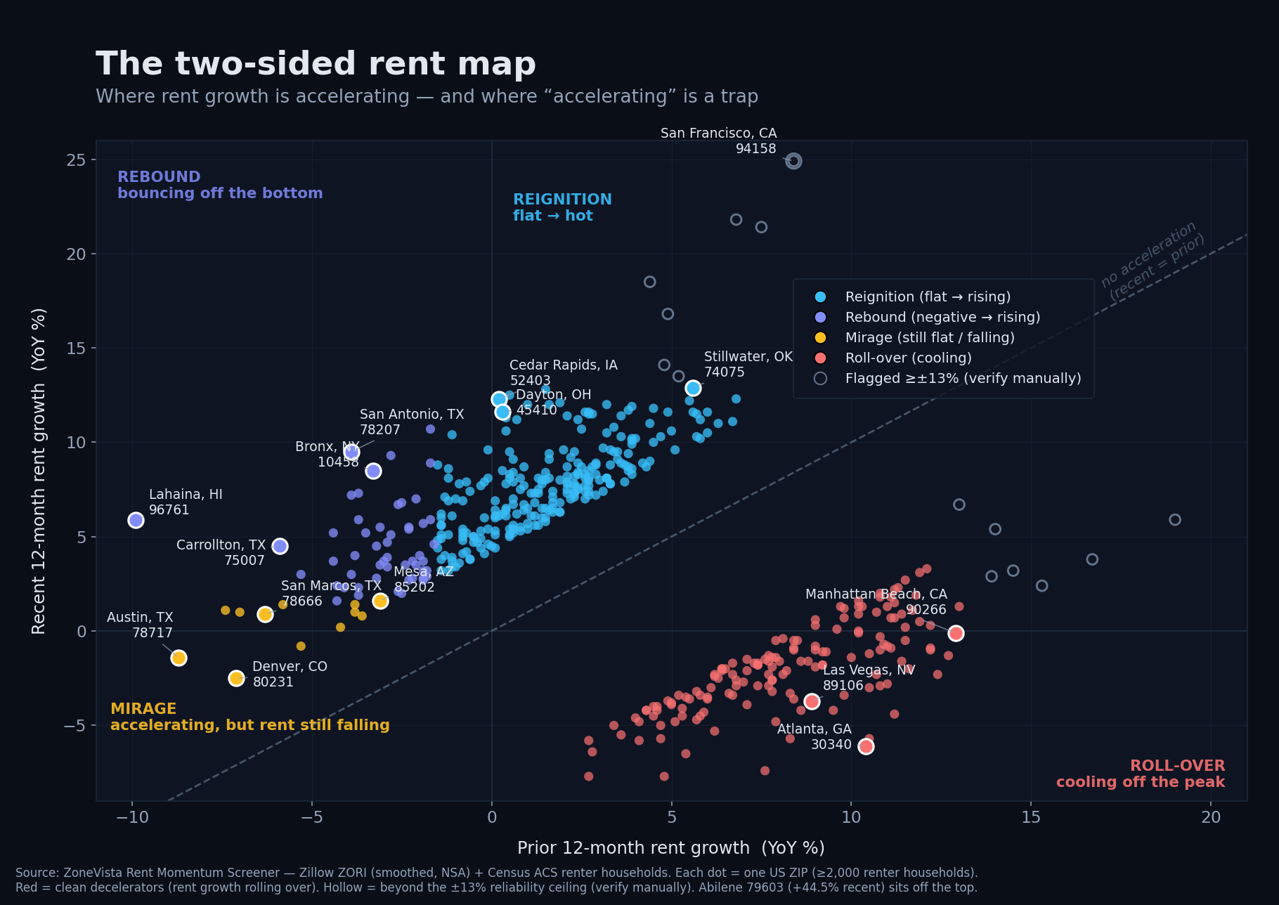
So I ran the acceleration screen across every ZIP with enough rent history to compute it honestly — about 5,400 of them — and the map that came back is not the one the last cycle’s narrative would draw.
The heat moved to the places everyone stopped watching
The cleanest accelerators in the country right now are not the Sun Belt boomtowns. They’re the Midwest and the Rust Belt.
Cedar Rapids, Iowa (52403) went from +0.2% rent growth a year ago to +12.3% — a 12-point swing from flat to genuinely hot. Dayton, Cincinnati, Pittsburgh, Cleveland, the Lansing suburbs, Grand Rapids — the same shape over and over: roughly flat twelve months ago, high-single to low-double digits now. Stillwater, Oklahoma (74075) was already running at +5.6% and pushed to +12.9%, the rare market that was hot and still accelerated.
These are unglamorous, cash-flow markets — the ones institutional money mostly skipped for a decade while it chased appreciation in Phoenix and Austin. They are also exactly where an acceleration screen points you first, because the metric is built to catch a turn early rather than confirm a trend everyone already knows.
There’s a second heating cluster, and it’s the opposite end of the price spectrum: the expensive coastal gateways waking back up. New York’s outer boroughs are all over the top of the screen — the Bronx (10458) went from -3.3% to +8.5% across more than 27,000 renter households, with 10463 and 10469 close behind. That’s a high-conviction signal precisely because the renter base is so large; this isn’t a thin market lurching on a handful of leases. (San Francisco is doing the same thing, harder — more on that below, because the screen makes you handle it carefully.)
The trap: three different things wear the same badge
Now the part that separates a screen you can use from a leaderboard that fools you.
“Accelerating” is not one story. It’s three, and only the columns — not the rank — tell them apart.
Reignition. Prior growth roughly flat, recent growth strong. This is real new momentum from a standing start: Cedar Rapids, Dayton, Cincinnati. When the metric works, this is what it’s catching.
Rebound. Prior growth deeply negative, recent growth positive — a market that cratered and turned. The single biggest accelerator on the entire screen is Lahaina, Hawaii (96761), at +15.9 points, swinging from -9.9% to +5.9%. But that almost certainly reflects the housing dislocation that followed the 2023 wildfire — destroyed units, displacement, insurance-and-rebuild demand — not organic market strength. It’s a real number describing an abnormal situation, and you’d confirm the cause before reading it as a trend. San Antonio’s 78207 (-3.9% to +9.5%) and Carrollton, Texas (75007) are cleaner rebounds, but the principle holds: a market bouncing off a hole is a different bet than one igniting from flat.
Mirage. Prior growth deeply negative, recent growth still negative or barely positive. These ZIPs rank as accelerators only because the fall is slowing — and they are the trap. Austin is the poster child. ZIP 78717 went from -8.7% to -1.4%: that’s a +7.3-point “acceleration” on a market where rent is still falling. 78750, San Marcos (78666, on nearly 21,000 renter households), and Kyle (78640, still negative) tell the same story. Screen on the acceleration rank alone and you walk straight into a market that hasn’t finished correcting, convinced you found momentum.
That third category is the whole reason you read the columns. The metric points; it doesn’t decide.
The cooling side is real — it’s just hiding inside flattering numbers
Which is the bridge to the other half of the map. The Sun Belt markets that led the last cycle aren’t crashing. They’re grinding off an overshoot, and acceleration flatters them on the way down.
Austin, Phoenix (Mesa’s 85202 went -3.1% to +1.6%; Glendale and north Phoenix look similar), and Denver (80231 at -7.1% to -2.5% — still falling; Aurora’s 80013 barely positive) keep showing recent growth at or near zero after deep prior declines. On an acceleration leaderboard they look like they’re turning. Read the level instead and you see what’s actually happening: the correction is decelerating, not reversing. The honest investor takeaway on this cohort is “watch,” not “buy.”
And the genuine roll-over — the clean cohort whose growth has actually reversed — is the other half of the map. Pull the bottom of the same screen and a coherent cooling group appears: ZIPs that were running +9% to +13% a year ago and have flipped to flat or falling today, every one inside the reliability bounds.
The deepest is Atlanta’s 30340: +10.4% a year ago, −6.1% now — a 16-point swing into outright decline. The standout cluster is Tampa Bay, where St. Petersburg, Clearwater, Largo, and Pinellas Park have all rolled from solid positive growth into negative territory. Add Las Vegas (89106: +8.9% → −3.7%), Phoenix, and a row of Texas markets — Denton, San Antonio, Houston — and the Sun Belt cooling pattern gets its cleanest confirmation yet.
But cooling, like heating, refuses to sort by region — and that’s the part worth sitting with. Some of the steepest clean roll-overs are expensive coastal pockets. Manhattan Beach went from +12.9% to −0.1%. The San Gabriel and San Fernando Valleys in Los Angeles are giving back gains, and so is a thick band of close-in Washington, D.C. ZIPs — the District itself, Arlington, Alexandria, Fairfax. These ran hottest on the post-pandemic snapback and are unwinding it fastest. Each side of this map is a coalition, not a region.
Why a screen like this needs guard rails
A quick word on method, because it’s where the trust is won or lost.
Acceleration is the difference of two noisy numbers, which means the noise roughly doubles and artifacts float straight to the top. Left ungoverned, this screen would be garbage at exactly the rows you’d look at first. So three filters run underneath it: a size floor (at least 2,000 renter households, from Census data, to drop thin markets that lurch on a few leases), a history gate (about 25 months, so both year-over-year windows are real), and a ±13% plausibility ceiling.
Anything beyond ±13% gets routed to “verify manually” rather than ranked. That ceiling catches fakes: Abilene, Texas (79603) “posting” +44.5% year-over-year on an otherwise smooth series is a composition artifact, not a rent explosion. But — and this is the part I think actually matters — the same ceiling also catches real signal. A coherent run of San Francisco ZIPs (94158 at +24.9%, 94105 at +21.8%, 94109 at +16.8% across 26,000 households) is far too consistent across the city to be noise. That’s a genuine citywide rebound the ceiling flags but does not dismiss.
The discipline is to check, not to assume — and to surface the ambiguous tail honestly instead of quietly deleting it. A screen that hides its hard cases is lying to you by omission.
How to actually use an acceleration screen
If you take one thing from this, let it be that the acceleration rank is a question, not an answer. Here’s how I read it:
- Reignition (flat to strong): the clearest new momentum. Then ask why — jobs, in-migration, supply constraints — before you believe it lasts.
- Rebound (negative to positive): earlier and more contrarian, with more risk. Make sure the cause is durable and not a one-off dislocation.
- Mirage (negative to still-negative): not a green light. The level is still falling; the metric is just measuring how fast.
- Roll-over (was rising, now flat or falling): the clean cooling signal. Not a crash, but the trend has turned — reprice before you underwrite last year’s rent growth.
- Flagged (verify manually): never act without a second source. Sometimes it’s Abilene. Sometimes it’s San Francisco. You don’t get to guess which.
The national rent number is a fiction for anyone who actually buys property. Underneath it is a map with a heating side and a cooling side — and this cycle, the heat is in the Midwest and the reawakening coasts while the cooling runs broad: Sun Belt boomtowns and overheated coastal pockets alike, giving back last year’s gains. Acceleration is how you find that turn before it becomes a headline.
Just read the columns, not the rank.
This screen — the size floor, the calendar-aligned windows, the ±13% guard — runs live inside ZoneVista’s Rent Momentum Screener, which ranks every qualifying ZIP by acceleration on demand.
Rent data: Zillow ZORI, smoothed, non-seasonally-adjusted, all-homes, at ZIP-code grain, through [Data as of April 2026 (Zillow ZORI, smoothed, NSA)]. Renter-household counts from Census ACS. Markets shown passed a size floor, a history gate, and a plausibility check; flagged markets are surfaced separately and labeled.