"Can They Pay the Rent?" Is the Wrong Question
Every rental investor, sizing up a new market, quietly asks the same thing: will the people who rent here actually pay?
It feels like the core question. It’s the wrong one — for two reasons.
The first is that the moment you try to answer “will the tenants here pay” by location, you’re one short step from screening by who lives there. That’s a Fair Housing problem, and dressing it up as analytics doesn’t make it less of one.
The second is more practical. Even if you could predict individual payment, you’d be reading a lagging signal. By the time missed payments show up in your ledger, the market tightened months earlier. You’d be reacting, not underwriting.
So the better question isn’t about the tenant. It’s about the market.
The durable question
Here’s the question that actually helps you underwrite: how much margin do renters in this market have before rent becomes unaffordable — and how exposed is the market if conditions tighten?
Call it durability. A durable market absorbs a shock. A thin one converts the same shock — a layoff wave, a rent bump, a round of credit tightening — into turnover, delinquency, and concessions. Durability is a property of the environment renters face. It is not a prediction about any individual’s behavior, and it never touches who they are.
That distinction isn’t a disclaimer. It’s the whole design.
Four signals, four federal sources
To measure durability I lean on four independent signals, each from a different federal dataset, so the score isn’t four flavors of the same number:
- Rent burden — the share of renters already paying 30%+ of income on rent (Census ACS). The static stretch: how thin the cushion is right now.
- Local unemployment — monthly, county-level (BLS LAUS). The income-shock channel: how likely the cushion gets tested.
- Mortgage-credit denial — the local denial rate (CFPB HMDA). The exit valve. When renters who want to buy can’t get approved, they stay renters and stay rent-exposed — and a high denial rate flags tighter local credit generally.
- Rent vs. fair-market ceiling — current market rent (Zillow ZORI) against the HUD Fair Market Rent benchmark. How far market rent has already run past the affordability line.
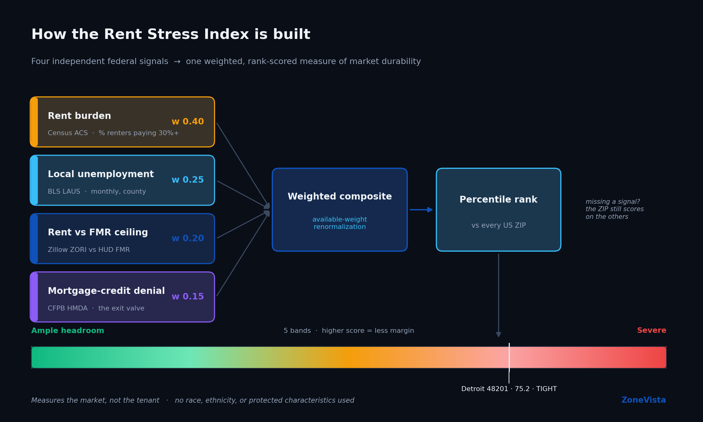
Each gets a weight — burden carries the most, then unemployment, then the rent gap, then denial — and the result is rank-scored against every other ZIP in the country. A high score means less headroom, not more.
A few honesty mechanics matter here, because they’re the difference between a real index and a black box:
- Coverage is renormalized, not faked. If a ZIP is missing one signal, it still scores on the others rather than getting silently dropped or quietly padded with a guess. You can see how many of the four signals it’s actually built on.
- It’s a percentile rank, so the score moves when other markets move — not only when a ZIP’s own fundamentals change. That’s why every market view shows the four raw signals over time, not just the rank line. The rank tells you where a market sits; the raw signals tell you why.
- The rent gap is anchored to today’s ceiling. A year-matched version is on the roadmap, and I’d rather say that out loud than let you assume more precision than it has.
And the thing the index deliberately does not use: race, ethnicity, or any protected characteristic. Not because the data wasn’t reachable — because durability is a feature of the market, and predicting payment from who lives somewhere is both illegal and wrong. The reframe from “the tenant” to “the market” is what makes the whole thing defensible.
How to read it: Detroit’s 48201
Take Detroit’s 48201. It scores 75.2 — toward the tighter end of the national range. Underneath that single number:
- 54.9% rent burden — more than half of renters are already cost-stretched
- 6.3% unemployment — an elevated income-shock backdrop, and trending up over the last two years
- 21.1% mortgage denial — a hard exit valve; renters who’d buy largely can’t
- +8.3% rent over the fair-market ceiling — market rent has run past the benchmark and kept climbing
The trend lines tell you which way each signal is moving, and they don’t all point the same way: rent burden has actually been easing here over the past several years, while unemployment and the rent-vs-ceiling gap are the two signals doing the tightening. That nuance is the point — durability isn’t one number deteriorating, it’s a balance of forces.
Read together, the takeaway is not “tenants here won’t pay.” It’s: this market has little margin, and if the income side or the rent gap tightens further, the operational consequences land fast. An investor who reads that doesn’t go screen tenants. They adjust the underwriting — vacancy and turnover assumptions, the concession budget, how much rent growth they’re really willing to bet on.
That’s the entire point. Durability is the leading indicator. Occupancy is the lagging one. I’d rather know the headroom before I sign.
The lens, then the tool
You can apply the durability lens to any deal without a subscription — it’s just a discipline: stop asking whether the tenants will pay, and start asking how much the market can take.
If you want it scored for you, the Rent Stress Index ranks 26,000+ US ZIP codes on exactly these four signals, with the full component breakdown, the trend charts behind each signal, and a county map of where headroom is thinnest.
Sources: Census ACS · BLS LAUS · CFPB HMDA · HUD FMR · Zillow ZORI. Full methodology.