The Cheap-House Yield Premium Survives — Except Where You'd Expect
Last week I showed that inside a metro, a high-yield ZIP is high-yield almost entirely because its homes are cheap, not because its rents are strong. The obvious pushback: cheap houses appreciate slower, so you give the premium back on the value side — a yield trap. Against the May-2026 warehouse the answer is a partial trap, not a full one — and where it becomes a full trap is exactly where you’d guess.
The setup
Same base as last time: every ZIP with both a Zillow home-value and a rent index, gross yield = annual rent over home value. 8,346 ZIPs across 695 metros, median gross yield 5.59%. I added trailing 12-month home-value appreciation (100% of the yield base) and defined total return, gross, as the two added. Within-metro work keeps the 20-ZIP-per-metro floor (6,001 ZIPs, 87 metros).
The trap is real: higher yield, slower appreciation
Within each metro — ZIP versus neighbor — the correlation between a ZIP’s gross yield and its trailing appreciation is −0.40. The cheaper, higher-yield ZIPs appreciated more slowly than the pricier ones in the same metro. (Last time I ran this test the naive cut came back positive against my prediction; this one didn’t.)
But the premium survives anyway
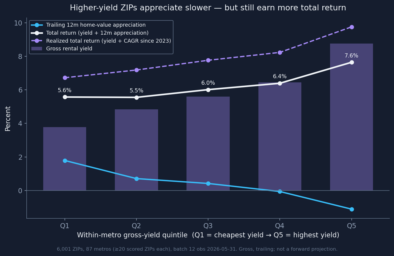
Across within-metro yield quintiles: gross yield climbs 3.8% → 8.8%, appreciation falls +1.8% → −1.1%, and total return still climbs 5.6% → 7.6%, monotonically. The give-back eats about 58% of the yield premium; roughly 42% survives. A quieter flip: last week yield dispersion was ~70% within-metro; total return is only 42% within-metro — appreciation is a metro-level phenomenon, so which metro starts to matter more than which ZIP.
Where it survives, and where it doesn’t — by name
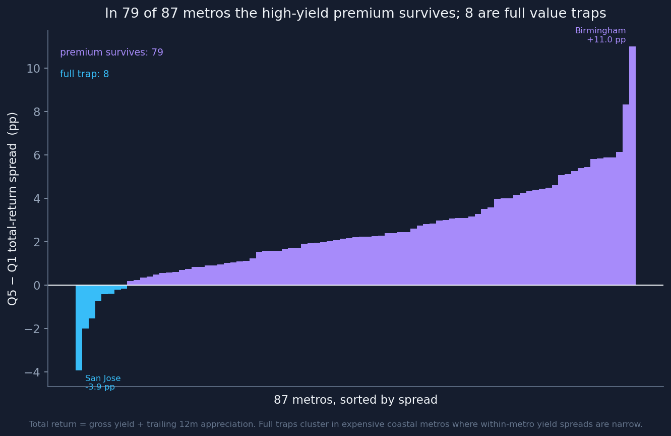
Metro by metro, in 79 of 87 metros the high-yield premium survives; in 8 it’s a full trap. The survivors are cheap-basis metros with wide yield spreads: Birmingham posts a +11-point total-return edge for its high-yield fifth even after the give-back, St. Louis about +8, Baltimore and Rochester about +6. The full traps are the expensive, compressed markets: San Jose is the cleanest — a ~2.8-point yield spread swamped by a ~6.7-point appreciation give-back, so its high-yield ZIPs lost by about −4 points — alongside San Francisco (−2.0), San Diego (−1.5), Los Angeles, Providence, Miami, Salt Lake City, and Atlanta.
The rule is really about spread: the premium survives wherever the within-metro yield spread is wide enough to outrun the appreciation give-back, and fails where prices are compressed at the top. I’m naming both the survivors and the traps on purpose — this is a description of how prices are distributed inside these metros, a market-composition fact, not a buy list and not a verdict on anyone who lives there.
Does it hold up over a real hold?
Median appreciation this window was just 0.73%, so I stress-tested. The negative relationship holds at 3 years (−0.33) and 5 years (−0.26) as well as 12 months (−0.40) — durable, attenuating. And over a real 2023→2026 hold, annualizing actual home-value growth, the premium survived more clearly: the give-back shrank to ~−1.9 points and the high-yield fifth beat the low fifth by +3.0 points, monotonically. Zillow’s forward forecast leans the same way — expensive collapse-markets are forecast to keep sliding — but that’s a forecast, not a fact.
What it means for capital
The low price costs you real appreciation — the trade-off isn’t free — but in most metros the cash-flow edge still wins total return after the haircut. Be careful exactly where the yield spread is thin: the expensive, compressed markets like the coastal California names above, where “high yield for here” is the value trap the folklore warns about.
Limits, up front
Gross total return from two observed Zillow legs. No leverage, costs, or taxes (not cleanly in the warehouse at ZIP grain). Only about a third of ZIPs carry a usable rent index, skewed denser — a coverage floor, not a census. Everything but the forecast check is trailing to May 2026. The realized-hold panel only sees ZIPs with coverage at both ends, so survivorship is in there. This describes housing-market structure — whether a ZIP’s yield edge survives its own price trajectory — not the households who live there, and it is not a prediction about any tenant.