A Hot Market Won't Pay Your Mortgage
There’s a shorthand that runs through almost every conversation about where to buy: a hot market is a good market. Homes fly off the shelf, buyers line up, and somewhere in there the heat quietly gets promoted from this market is in demand to this market will cash flow. Those are two different claims. One is how fast the market clears. The other is how much rent a dollar of price buys you. I put them side by side to see whether the warehouse agrees they’re the same thing.
I took mean days-to-pending — how fast listings go under contract, the cleanest available heat measure — and set it next to gross rental yield across 672 metros at the current snapshot (May 2026). The short version: the shorthand is directionally real and practically useless, and the useful part is what the correlation hides.
The correction, honestly scoped
Faster markets do carry thinner yield. Sort the 672 metros into five buckets by absorption speed and the gradient is gentle and near-monotone: the fastest fifth (15–37 days, averaging 29) yields 5.84%, the slowest fifth (78–157 days, averaging 96) yields 6.56% — a spread of about 0.72 of a percentage point.
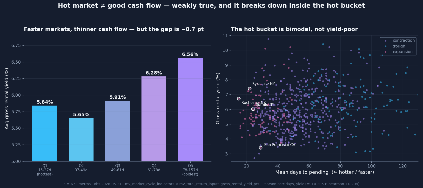
The correlation between days-to-pending and yield is +0.21 (positive because more days means more yield), and the rank-based Spearman version agrees at +0.20 — so it isn’t one or two outliers dragging the line. From the heat side the sign flips as expected: −0.17 on a composite heat score, −0.24 on the market-temperature index.
Here’s the part that matters. Those correlations are small. An absolute r around 0.17 to 0.24 means market heat explains only ~3 to 6 percent of the cross-metro variance in yield. So the defensible claim isn’t “hot markets have bad cash flow.” It’s the stronger, duller one: market heat is a poor predictor of cash flow — you cannot read one off the other.
The self-correction
Going in, I expected a strong negative heat↔yield link — the tidy story that hot, bid-up markets get their yield crushed by price. It came back weak (−0.17 to −0.24), not strong — the second time recently a yield relationship has refused to be as dramatic as I guessed (the yield-versus-appreciation cut came in at +0.077 when I’d have bet on a clean negative, and I said so then too).
And it’s messier than weak. Sort by heat instead of speed and the yield gradient stops being monotone: the lowest average yield sits not in the hottest bucket but in the second-hottest, bottoming around 5.50%, while the very hottest fifth rebounds to 5.88%. The hottest markets are not the yield-poorest markets. Cut it by market-cycle phase and the same shrug appears: expansion metros (30 days, hot) yield 5.90%, contraction metros (54 days) yield 5.97% — the same, within noise — and only bottomed-out trough metros (86 days, cold) pay a real premium at 6.41%. Heat buys almost nothing on yield until the cold extreme.
The real story: the hot bucket is bimodal
If the correlation is the boring part, this earns the piece. The hottest markets don’t cluster around one yield — they split. Among top-heat metros, some go pending in the low 20s of days and yield well over 7% (the upstate-New-York cluster — Syracuse, Rochester, Buffalo), while an equally hot coastal market like San Francisco goes pending in the high 20s and yields 3.40%. Same “hot,” roughly four points of gross yield apart. Heat put them in the same bucket and had nothing to say about which would actually feed you.
That’s the bimodality: the fast-selling markets are not one population but two — cash-flow winners and cash-flow deserts — and absorption speed cannot tell them apart. It’s the same signature the “Yield Trap That Wasn’t” piece found, on a new axis: clearing speed versus yield instead of entry-yield versus appreciation. The aggregate is a blur. If a market’s heat is why you’re excited, you haven’t learned anything about its cash flow yet — you have to price rent against value directly. There’s no shortcut through speed.
Why the mechanical objection doesn’t sink it
The sharpest pushback: yield has price in its denominator, and a hot market bids that price up, so of course heat and yield move against each other — partly just arithmetic. True, and worth saying plainly. Part of the thin-yield-in-fast-markets result is mechanical: you pay up for heat, and paying up compresses rent-over-price. But if it were purely mechanical, the hottest markets would be uniformly yield-poor — and the fast-and-fat upstate metros prove they aren’t. The mechanical echo is real; it isn’t the whole engine.
Coverage, and what this isn’t
This is 672 metros — the ones carrying both a usable absorption reading and a usable rent-to-value pairing. About 250 metros drop out for lack of a clean rent index; they skew small and thin-rent, so the universe leans toward larger, more rentable markets. That bias, if anything, understates the cold, rural, high-yield end, which would only strengthen the slow-equals-higher-yield leg. This is a cross-sectional read — no claim that days-to-pending predicts future yield. But it isn’t a fluke: the same weak-positive relationship shows up at four May snapshots back to 2019, strongest before the 2020 boom (+0.36 in 2019) and weakest at the 2022 peak (+0.24), when nearly every market ran hot and heat lost its power to tell metros apart. A real, small, durable, regime-sensitive effect.
And to be precise: days-to-pending is seller-side clearing speed, how fast a market absorbs listings. It’s a market-durability signal, not a statement about the people who rent in these places, and nothing here forecasts anyone’s payment behavior.
What it means for capital
Speed and cash flow are two different instruments reading two different things. A fast market tells you demand is showing up. It does not tell you the margin is there. The correlation is real enough to prove they’re related and weak enough to prove they don’t substitute — and inside the hottest markets, where the shorthand is loudest, it falls apart entirely into winners and deserts that heat cannot separate. Absorption speed measures how fast a market clears; it says almost nothing about how durable the cash-flow margin is once you own the thing. You need both lenses, because this is the proof that one won’t stand in for the other.