High Yield Isn't a Signal. It's a Price Tag.
A founder I trade notes with put a frame to me that I keep coming back to: yield is a symptom, not a signal. I couldn’t disprove it, so I went looking for what it’s a symptom of — because a symptom is only useful once you know the disease.
Against the May-2026 warehouse, the answer is blunt. When one market shows a higher rental yield than another, that gap is almost entirely a statement about price, and almost not at all about anything you’d call market durability. High yield isn’t a reading off some hidden gauge of a market’s strength. It’s a price tag with the decimal moved.
Yield is an identity, not a measurement
Gross rental yield isn’t measured — it’s assembled: annual rent ÷ price. There’s no
sensor, no survey. It’s two numbers you already have, arranged into a ratio. I checked
that this is literally true and not just definitional: pull the stored yield for a
random handful of markets, recompute annual rent ÷ price by hand, and the two match
to four decimal places every time. The warehouse isn’t measuring yield. It’s dividing.
Across the 934 regions here, 721 carry both a usable rent index and a price. Their gross yields run 2.7% to 13.0%, mean 6.1%, with 717 distinct values — a live, well-dispersed variable, not one of the flat or broken indices kept off every chart. Real spread to explain.
The decomposition: 137% price, minus 37% rent
Because yield is a ratio, log-yield is a difference — log(rent) − log(price) — and a
difference has an exact variance identity: the spread in yields across markets splits
into a rent contribution and a price contribution that must sum to 100%. No modeling,
no knobs.
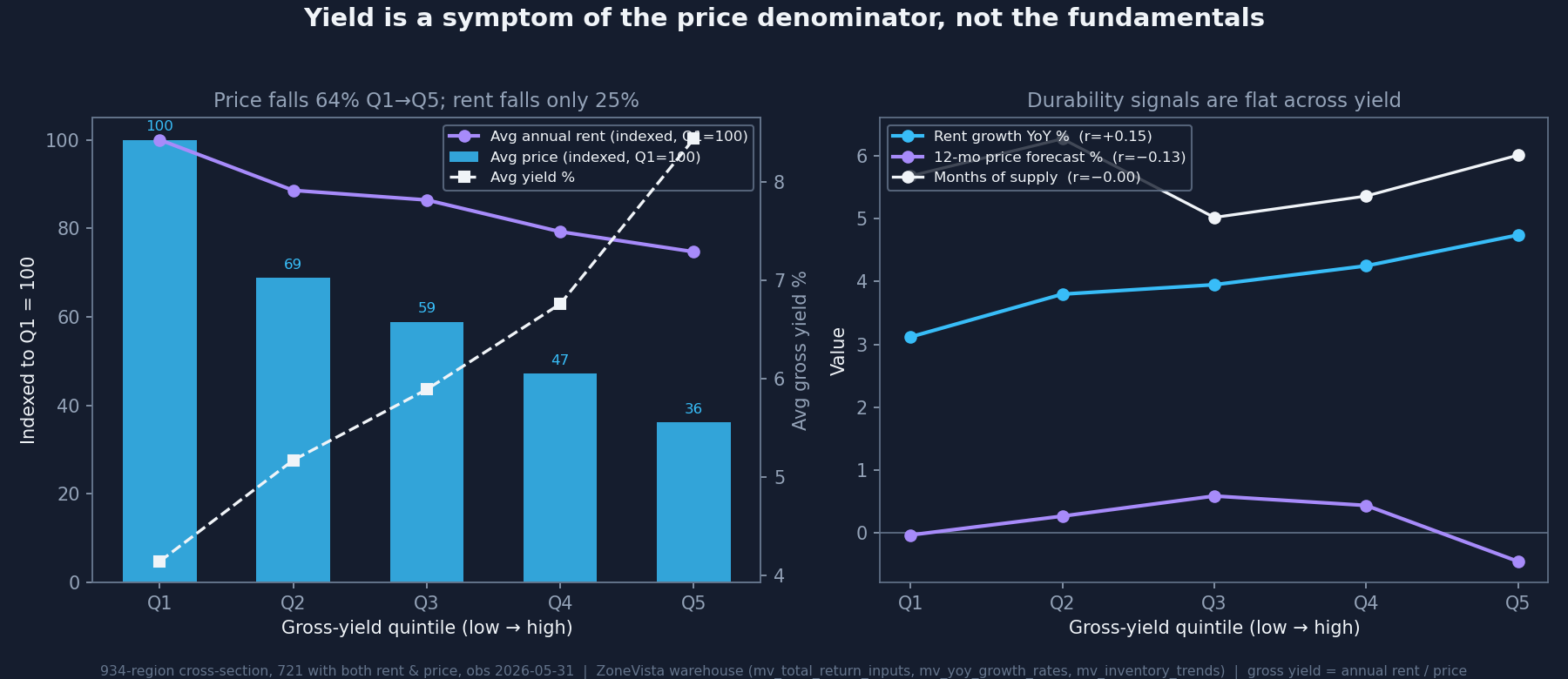
Across the 721 markets:
- The price denominator contributes +137% of cross-market yield variance.
- The rent numerator contributes −37%.
They sum to 100%, as they must — but the rent term is negative. Rent actively reduces the spread in yields, because rents and prices move together across markets at a correlation of 0.84. Expensive markets have expensive rents; cheap markets, cheap rents. The two move in near-lockstep, so the rent term keeps cancelling the price term, and the only thing left to make yields diverge is the residual by which prices differ more than rents — and prices do, carrying 2.25× the variance of rents. High yield ≈ cheap price. Not “correlated with.” Made of.
Yield is nearly blind to durability
If yield were a genuine signal, it should line up with something that describes a market’s durability. Against the full battery, same 721 markets:
- yield vs. price level: −0.75 — the one strong tie, and it’s price again.
- yield vs. year-over-year price growth: −0.02. Nothing.
- yield vs. months of supply: −0.003. Nothing.
- yield vs. the market’s own 12-month price forecast: −0.13.
- yield vs. days-to-pending: +0.21 — higher-yield markets sell a touch slower, the opposite of hot.
Sort into yield quintiles and it’s plainer still: from the lowest-yield fifth to the highest, average price falls 64% ($520k → $188k) while rent falls only 25% ($20.9k → $15.6k). The fundamentals don’t sort — price growth flat-to-non-monotone, supply flat, the forward forecast actually lowest in the top-yield fifth. The thing that moves monotonically across yield is price.
Two things I have to correct, because the data did
Yield is not pure noise on the rent side. There’s a faint but real positive tilt to rent growth — +0.15 raw, +0.18 on ranks, climbing monotonically across the quintiles (3.1% → 4.7%). Small, swamped by price, but real — the same residue “The Yield Trap That Wasn’t” found: cheap high-yield markets are not uniformly decaying. So yield isn’t dumb; it carries a whisper of a rent-growth signal, buried under a shout, and the shout is price.
Yield does not predict lower future appreciation. The −0.13 correlation with the forecast is tempting to read as “high yield, weak forward growth,” but it collapses to −0.01 on ranks — outlier-driven. The honest claim is the weaker, cleaner one: yield tells you essentially nothing about forward appreciation. Not that it predicts less.
What this is, and what it isn’t
A snapshot — one clean cross-section as of May 31, 2026 — and a compositional claim, not a causal or forward one. Built on the 721 of 934 markets that carry both a rent and a price index; the 196 without a usable rent index skew toward thinner, smaller geographies, so the selection cuts in the conservative direction — if anything it understates the price story. It’s at metro grain — between-market variance, deliberately not the within-metro, ZIP-versus-ZIP dispersion covered separately; different grain, kept apart on purpose. And it describes market structure — what drives the yield ratio across housing markets — not the households who live in them. It is a durability-composition measure, never a prediction about any tenant.
The takeaway
Yield is the output, not the input. If it’s a symptom of the price denominator, stop treating it as the answer and treat it as the thing to be explained — then look through it to the supply, rent-growth, and price drivers that actually carry a market’s durability. A high yield tells you a house is cheap. Whether cheap is durable is a completely separate question, and yield barely knows the answer.
Credit where it’s owed: the “yield is a symptom” framing isn’t mine. It came from a fellow founder working the same problem from a different angle, and it’s a good frame. This is just the warehouse naming what the symptom is a symptom of.