The Yield–Appreciation Tradeoff Was Real. Then It Broke.
A few weeks ago I posted a small finding to a real estate forum: across U.S. metros, size barely predicts rent yield. Big metro, small metro — the gap between the highest and lowest size tiers came to about a third of a percentage point. The post wasn’t the interesting part. The replies were.
Two of them pushed the question somewhere I hadn’t taken it. The first, from a reader named Morgan, made a point I had to concede on the spot: the metro is just a bucket. The real variation in yield isn’t between metros, it’s inside them — and when I ran it, two-thirds of all the variation in ZIP-level yield turned out to live within metros, not across them. Picking the metro barely narrows anything. The deal lives a level below.
The second reply, from a reader named Tabish, asked the question that became this piece. If high yield is real, doesn’t it cost you something? Specifically: don’t the highest-yield metros have the lowest long-run appreciation? That’s the oldest tradeoff in the book. He wanted to know whether it actually holds up in the data, or whether it’s another piece of conventional wisdom that everyone repeats and nobody checks.
I had the data to check it, 2015 through 2026. The answer surprised me — enough that I want to walk through it carefully, including the part where my own prediction was wrong.
The rule everyone knows
The conventional wisdom is clean, which is part of why it’s so durable. There are cashflow markets and there are appreciation markets, and you pick your lane. Cashflow markets are the cheaper, higher-yield places — much of the Midwest and the South — where rent is strong relative to price but values creep. Appreciation markets are the expensive, low-yield coasts, where you bleed a little on monthly cashflow but the equity compounds. High yield, low growth. Low yield, high growth. You can’t have both.
It’s a satisfying rule. It’s also, like a lot of satisfying rules, mostly a description of one particular era that everyone mistook for a law.
Why this is easy to test wrong
Before the answer, the trap — because it’s the reason this question is rarely answered honestly.
The obvious way to check is to sort metros by their yield today and compare against how much they’ve appreciated. Do that and you’ll usually find the inverse you expected: low-yield markets appreciated, high-yield markets didn’t. Case closed.
Except it’s circular. Yield is rent divided by price. Appreciation is, by definition, price going up. So any market that appreciated a lot has, mechanically, a lower yield now — not because low yield caused the growth, but because the growth pushed price up and dragged the yield down with it. You haven’t discovered a relationship. You’ve rediscovered the definition of a fraction.
I measured exactly how strong that mechanical pull is. The correlation between a metro’s appreciation and the change in its yield over the same window is −0.59 — strong, negative, and entirely an accounting effect. If you’re not careful, that one number masquerades as the whole tradeoff.
To get a real answer, you have to do two things. Sort by entry yield — the yield you could actually have bought at, at a fixed point in the past — and then measure appreciation forward from that point. That breaks the circle, because the entry yield is fixed before any of the forward appreciation happens. And you have to look at separate eras, because a single boom can impersonate a permanent law.
Here’s where my prediction failed. I expected the naive cut — current yield against recent appreciation — to show a strong false inverse that I’d then expose. It didn’t. The correlation came back at +0.08: essentially zero. The mechanical echo is real, but it’s being canceled by something pulling the other way. When I sorted by entry yield instead and measured forward, the relationship wasn’t negative at all. It was +0.28. Markets you could have bought at higher yields in 2021 appreciated more over the following five years, not less.
So the folklore is wrong twice over. The part of it that looks inverse is just the accounting echo. And the real, structural signal points the opposite direction from the rule.
But “the opposite direction” is too strong a claim to leave there, so let me show the actual shape — which is the more honest and more interesting story.
True, then broken
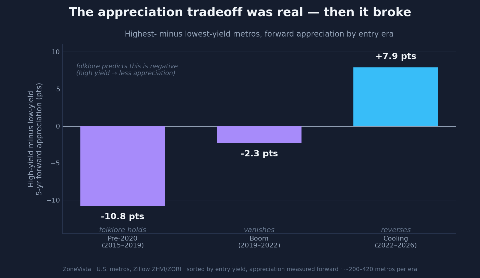
Split the last decade into three regimes and the rule’s whole life cycle shows up.
Before 2020 (2015–2019), the rule had a kernel of truth. Sort metros into five buckets by their 2015 entry yield and the lowest-yield bucket appreciated about 38% over the next five years; the highest-yield bucket, about 28%. A real gap, if a modest one — roughly two points a year. The rank correlation was −0.16. So the rule wasn’t invented out of nothing. It described the pre-2020 world reasonably well: the expensive coastal markets did out-appreciate the cheap high-yield ones.
During the boom (2019–2022), it vanished. Every yield bucket appreciated somewhere between 35% and 40%. The correlation was −0.02 — statistical noise. When everything is ripping, yield tells you nothing about appreciation, because nearly everything appreciates.
In the cooling (2022–2026), it reversed. The lowest-yield metros — many of them the 2021 boomtowns that had been bid up hardest — gave back the most, appreciating about 4%. The highest-yield metros kept gaining, around 12%. The correlation flipped to +0.27.
I want to be careful about that last one, because it’s the most tempting to over-sell. A good part of the cooling reversal is mean-reversion: the low-yield boomtowns overshot in 2021 and then corrected, which mechanically makes the high-yield markets look like winners. I’m not claiming a new law that high yield causes appreciation. I’m claiming the old law broke. Over three regimes, the rule that high yield costs you appreciation was clearly true in exactly one of them, gone in the second, and inverted in the third.
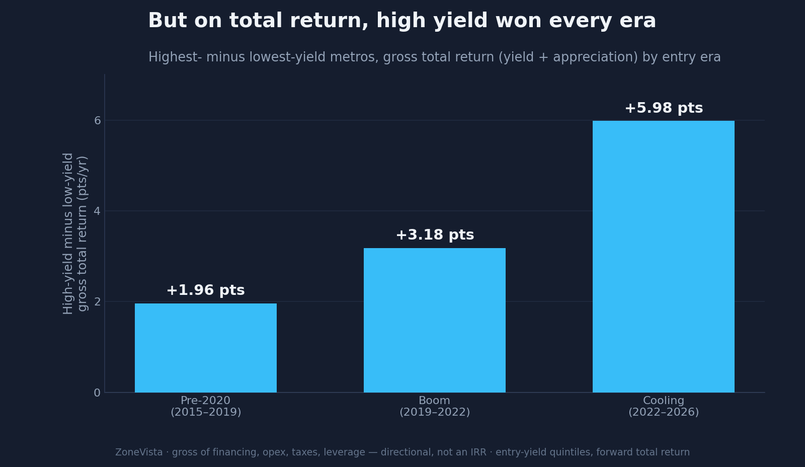
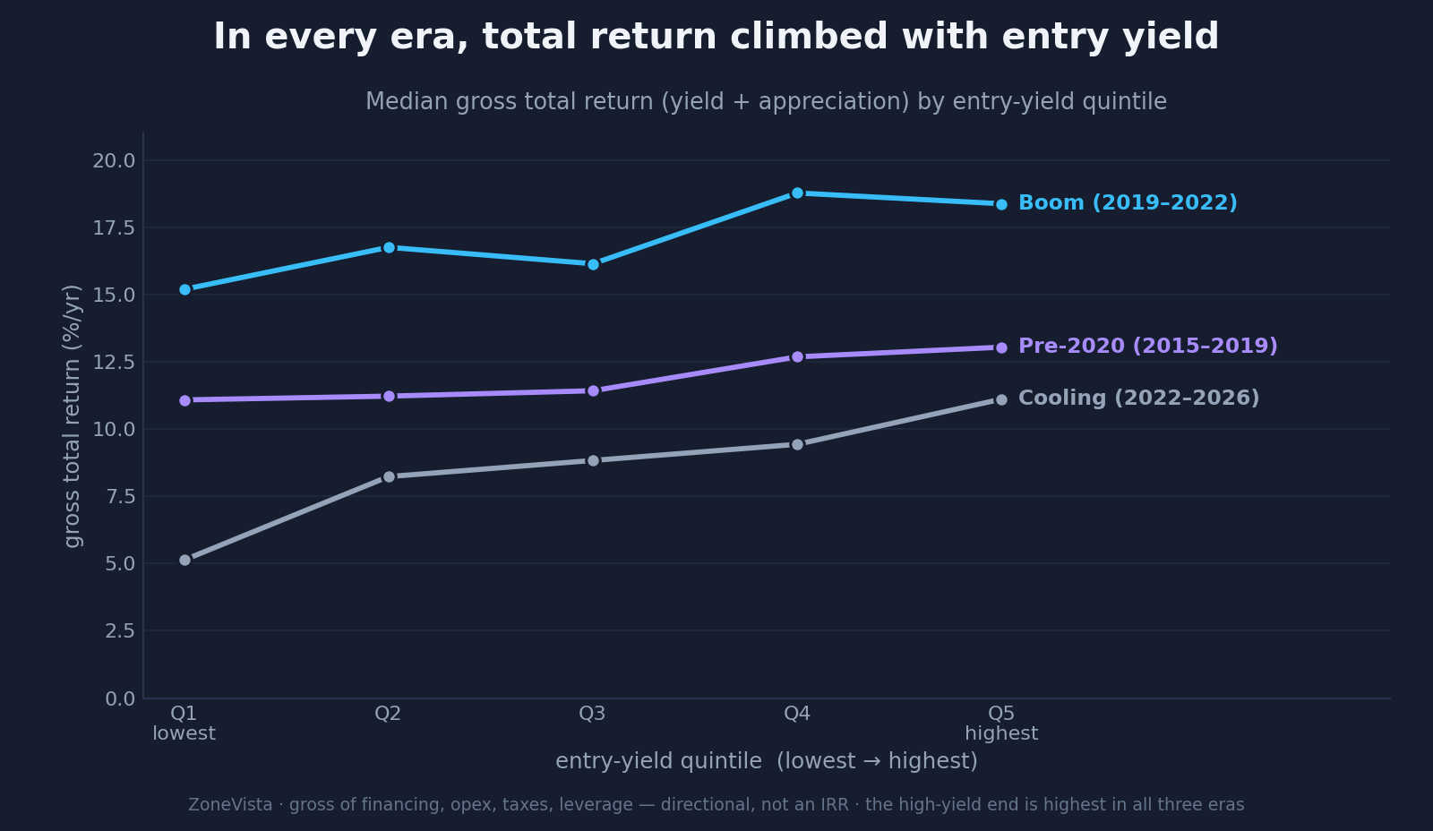
The number that actually matters
Here’s the thing about the tradeoff framing: no investor buys yield or appreciation. They buy both, and what they keep is the combination. So I folded the two together into a gross total-return figure — entry yield plus annualized appreciation. It’s a blunt instrument: it ignores financing, operating costs, taxes, and leverage, so treat it as a direction, not an IRR.
In every regime, the highest-yield bucket had the highest gross total return. Every one. The appreciation that high-yield markets gave up — where they gave up any — was always smaller than the extra yield they brought to the table. Before 2020 the high-yield edge on total return was about two points a year. In the cooling regime it was almost six.
Tabish framed his own instinct as “I’d rather own a 6% property with population and job growth than a 12% one in a market losing residents.” It’s a good instinct, and it’s right about what matters — the demand underneath the rent. But in the actual 2015–2026 data, the high-yield markets weren’t the ones losing residents and bleeding value. On total return, the high-yield engine was ahead the whole way.
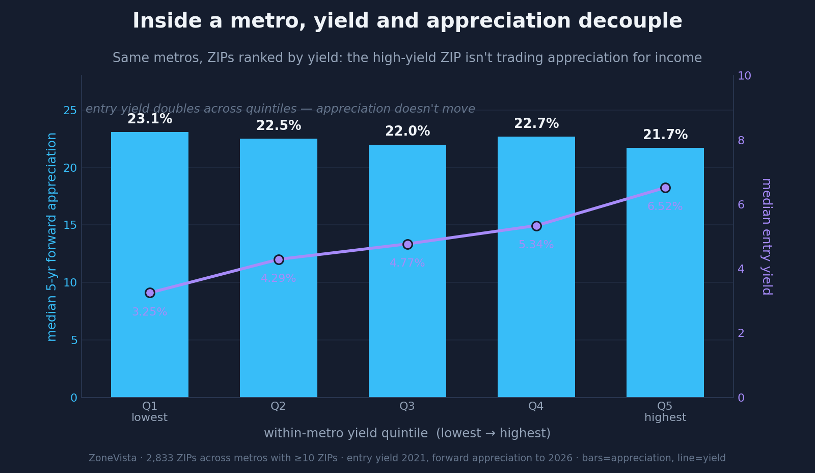
All the way down to the ZIP
This isn’t only a between-metro story. Take Morgan’s point seriously and go inside a single metro, rank its ZIPs by yield, and measure forward appreciation. Across thousands of ZIPs in the metros with enough coverage, all five yield buckets appreciated about the same — 22 to 23% over the recent five-year window. Within a metro, yield and appreciation are simply decoupled. The high-yield ZIP down the road isn’t quietly trading appreciation for income. It’s getting both.
That dovetails with something I’d found a week earlier, testing a different worry: those same high-yield ZIPs also weren’t the ones with softening rent. The penalty everyone assumes you pay for chasing yield inside a metro keeps failing to show up — not in rent durability, not in appreciation.
Yield is a symptom
Tabish put the right word on it in the thread: yield is a symptom, not a predictor. It’s downstream of risk perception, capital flows, how hard it is to build, and where demand is heading. When those shift, the yield shifts — and so does appreciation, often alongside it rather than against it. The tradeoff was never a law of physics. It was a faithful description of one capital regime — coastal money versus heartland value, roughly 2010s-vintage — that the last five years quietly rewrote.
What I can claim is narrow and solid. Across 2015–2026, the rule that high yield costs you appreciation held in one era of three, never held on a total-return basis, and disappears entirely inside metros. What I can’t claim is a forecast: regimes turn, and the next one could restore the old pattern. This is also blind to the markets that have hollowed out so far they no longer carry a usable rent index — the genuinely dying places are invisible here, by construction, and that’s exactly where the old tradeoff might still be alive.
But for the markets an investor can actually measure and actually buy, the tidy rule is mostly a fossil. Yield is a snapshot of a price ratio. The things that decide your return — whether the rent holds, whether the market keeps pulling demand — sit underneath it, and you have to look on purpose.
Which is the next thing I’m going to build toward. The half of the demand picture I still can’t see at fine grain is the leading half: household formation, vacancy direction, absorption. If those move before rent and price do, then yield isn’t just a symptom — it’s a lagging one. That’s the measurement worth chasing.
Thanks to Morgan and Tabish, whose questions on the original thread are the only reason this exists.